A proposal:
Any collection of information ALWAYS already has an inherent architecture — a scaffold or skeleton that both records how it was put together and regulates how it can grow. Such internal logic is distinct from what the data expresses (its visible ‘content’). Beyond the surface, this structural ‘information about information’ assembles in a digital artifact’s
meta-data.

The structure goes by many names: rhetoric, outline, framework, system. We
’d call it simply ‘typography’. The common understanding of typography is that it involves choosing fonts and arranging layouts, usually in view of so much style or decoration. We have a different idea. Yes,
typography is the soft science of point-size, line-spacing, weight, colour and so on. But it is equally – and more consequently – concerned with structure, and so with conveying intrinsic logic as more or less crisply rendered sets of dependent relationships. Typography is visual, and when it is done well, as well as transmitting its ostensible content, it also reflects its fundamental organization.

In the early days of the internet, the structural relationships between pieces of digital information on a website were known as its ‘Information Architecture’. The phrase seems almost quaint. Today we are thoroughly accustomed to the low-key magic of webpages drawing from live databases and assembling themselves in front of us on demand. The films site shows us what is playing now, nearby. The music site shows us the top 10 most-streamed songs. Youtube tells us who of our friends is watching what and when. And, of course, there is the info air we breathe,
Google.

Naturally, the information that comprises a Forensic Architecture website also has its own unique skeleton, its bones a collection of digital files in a variety of
media types, each governed by one of several format protocols. There will be plain text from a database, html markup text, javascript, php, and mysql queries. There will also be jpegs, gifs, pngs, rsa public keys, tiffs, mp4s, mp3s, movs, docs, and so on. All of this digital data is the raw material from which the site is built; and as we know, all materials – even digital ones – record the trace of their use, and so too of their evolution.
To serve the brief’s twin goals – clarity of internal organization and clarity of external interface – we therefore propose a website for FA that is PATENTLY structured by the skeleton of its information.
That sounds vague — let’s try again. We propose to build a website for FA where what it looks like and how it is assembled and maintained are mirror images of each other; and where the materiality of its digital contents is pronounced. This does not have to come at the cost of clarity or difficulty in navigation. The site should assemble itself by filing most recent information first, then articulate itself backwards – both in terms of the overall site and within each specific investigation. The content could then be dynamically filtered and displayed by project, by client, by collaborator, by individual contributor, by media, and so on. Consider the site the way we still picture a computer’s brain as a
branching file system, a primitive logic tree. And think of this filtering mechanism as essentially a search bar – albeit a distinctly SMART search bar that knows quite a lot about what it can find and isn’t coy about showing off that knowledge.

Ok, but what does it look like? Well, what you’re looking at now (as opposed to reading) is a start – but strictly only a start. We don’t mean to imply something self-consciously ‘default’ and certainly don’t intend something easily filed under the stylistic shorthand of ‘
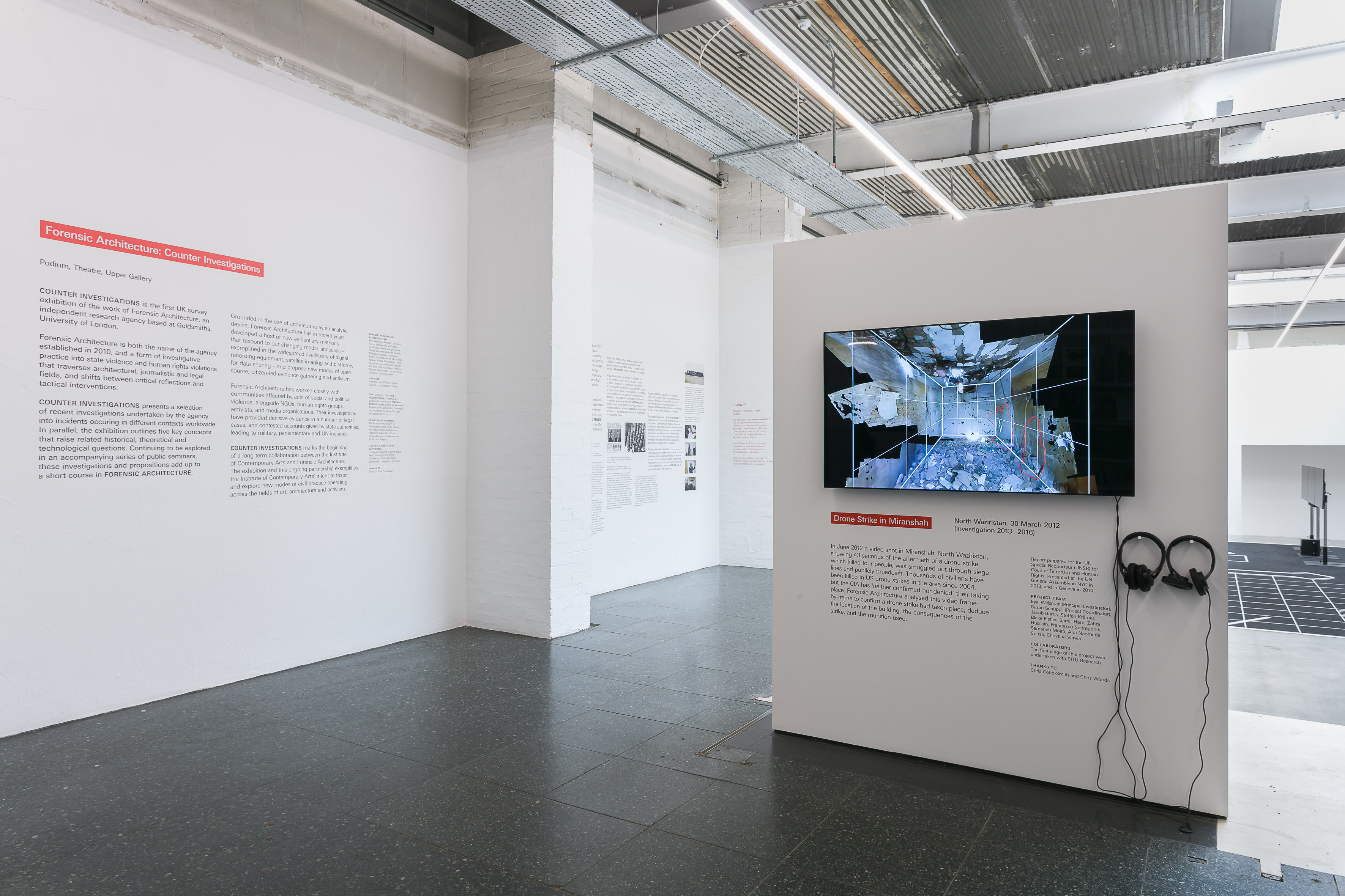
Brutalist web design’. We are suggesting something much more fundamental: an approach to the design that is baked into the organization of the materials. We might say, in fact, that contrary to the tired TROPE of Brutalist aesthetics, what we're proposing is actually in line with the two-fold premise of Brutalist SPIRIT. Namely, the pointed use of raw, fundamental materials and the setting up of spaces to be populated by multiple, changing content. We might productively take the graphic premise of the ‘key concept’ walls in
Counter Investigations as a jumping-off point. We are well-aware that the site needs to directly address various and distinct audiences at radically different scales, from students to governments.


As discussed during the Skype briefing, we feel that building a website as necessarily involved as FA’s by the end of summer 2018 is HIGHLY inadvisable and that it would be irresponsible to pretend otherwise. We instead propose to proceed over a six-month time frame, roughly broken down into two months of design development, three months of programming plus design development, and one month of refinement and optimization.
Any new website these days should obviously work as well on small mobile devices as it does on large desktop screens. With this in mind, it is worth reading this proposal on both types of hardware to get an idea how the dual purpose might play out.
The website’s Content Management System should also be carefully considered. We have no immediate prejudices, but wide experience with various standard and less-standard systems – including a
CMS developed by
David’s software company O-R-G that has been adapted consistently through four revised versions over the past 15 years and is currently used to run hundreds of websites. There are an increasing number of lightweight CMSs available and FA should not be tethered to either a monumental nor proprietary system. This choice should be taken in view of the rapid turnover of web standards.
Basic design fee: 2 months, £15,000
Development fee: 4 months, £45,000
Optimization fee: 1 month, £7,500
TOTAL: £67,500

One final word on the logotype at the top of this page — changing the colour of the Forensic Architecture lozenge from red to blue is not a mistake, a joke or a flippant decision. It simply seemed a straightforward yet engagingly strange thing to do in view of clinically marking the next stage of FA’s (online) existence.

